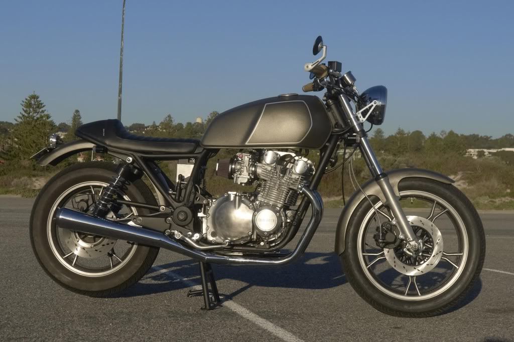
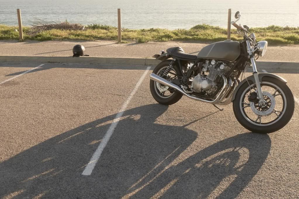
I will be doing something to the tank, but don't want to reveal what it is yet. Mainly because I have decided yet!
Another Aussie GS rebuild - GS1100G
Collapse
X
-
 JimmyR
Thanks guys. Yeah the clutch cover looks dirty in those pics - it's not. I finish the lower engine covers with scotchbrite, but the clutch cover needs a bit more work at the moment.
I will be doing something to the tank, but don't want to reveal what it is yet. Mainly because I have decided yet! -
 ptexotik
 -
Looks good Jimmy. It needs some sort of focal point on the tank, however subtle. Look forward to seeing what you come up with.
cgsigpic
83 GS1100g
2006 Triumph Sprint ST 1050
Ohhhh!........Torque sweet Temptress.........always whispering.... a murmuring SirenComment
-
 hjacobmiller
 -
 JimmyR
Exactly right. I have a couple of ideas, and that's why I say it's not finished. Thanks too! I am very happy with how it's working out. When I get the jetting right I will be even happier!Comment
-
 JimmyR
Ahah! Discovered that it's not running lean, if anything it's now rich. It's an exhaust leak which makes it feel like it's running lean. I've had a lot of trouble getting the exhaust to fit, but think I should have it sorted this weekend. I have some new gaskets and will be doubling up on them.
Still debating what to do with the tank. I think it needs something, but not very much. I think this is a bit too much, but close:

Comment
-
 Guest
Guest -
 JimmyR
 -
 Tim Tom
Wow I haven't seen this in a while, the bike looks fantastic mate!
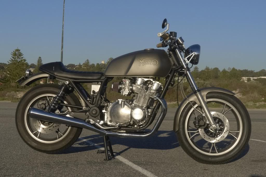
Agreed it needs something on the that tank though. If I recall Morton is like your company or something? If so cool, I dig it. I don't like it if it's meant to be a knock off of Norton, because this bike is so much better than that. I'd be concerned about people not realizing that Morton has a meaning specific to you, and detracting from the look of the bike. I do like the stylized font though. It fits the look of the bike really well.
The stock-ish tank pinstripe also looks great. It provides the contrast needed to make the tank visually pop.
Either one would be fantastic, but do something there!
Cheers,
TimComment
-
 Guest
Guest -
 JimmyR
I think you guys are right. I have come up with a variation on the pinstripe thing which I quite like. I do like the idea of a semi "worn-off" logo - something quite faint. But one thing is for sure - nothing will happen until I am absolutely sure about it. In the meantime I just want to ride it.
Today I am hoping to get the exhaust leaks fixed. That should probably do it, and hopefully it will be running perfectly.Comment
-
 JimmyR
Today got the exhaust leaks sealed. Finally! Still trying to tune the carbs - damn it's frustrating sometimes... So much trial and error. Hopefully tomorrow I will get it right.
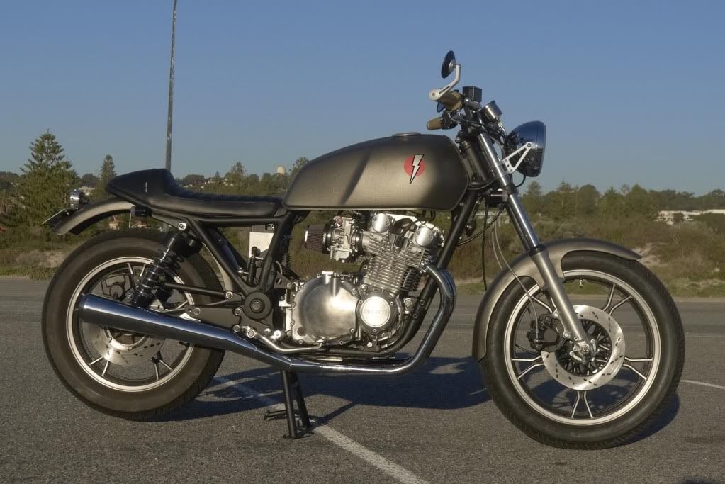
While I was being sociable today (Dad came around) I was fiddling with my computer a bit and came up with this as a tank idea. Prob my favourite so far but it will have to be perfect before I put it on my tank.

Comment
-
no.that logo doesnt work.THE BIKE IS PERFECT. Any logo you use should be very muted,almost like a watermark.That lightning bolt detracts from an understated bike.its entire appeal is theshudder simplicity of its design/redesign.make it right or leave it off.Last edited by ron bayless; 07-28-2012, 12:48 PM.future owner of some year and displacement GS bike,as yet unclaimed and unowned.Comment
-
 Guest
Guest
Yeah I gotta agree... must be understated Jimmy! That stands out way too much...Comment
-
 Guest
Guest
Actually, mock up a faded pinstripe around the knee dent instead of the main bit you did first...Comment


Comment